Config
The Replicated Config custom resource defines the application-specific configuration fields that you want to expose to your end customers. For example, if you let your customers bring their own external database, you could expose config fields for the database host, port, username, and password.
During application installation or upgrade, your end customers provide values for each config field either through the UI or with the ConfigValues custom resource (for headless installations).
Example
apiVersion: kots.io/v1beta1
kind: Config
metadata:
  name: outline-wiki-config
spec:
  groups:
    - name: general
      title: General
      items:
        - name: hostname
          title: Hostname
          help_text: |
            The hostname customers will use to access Outline (e.g. outline.example.com).
          type: text
          required: true

    - name: database
      title: Database
      items:
        - name: postgres_type
          title: PostgreSQL
          type: select_one
          default: embedded_postgres
          items:
            - name: embedded_postgres
              title: Embedded PostgreSQL
            - name: external_postgres
              title: External PostgreSQL
        - name: embedded_postgres_password
          title: Embedded PostgreSQL Password
          type: password
          value: 'repl{{ RandomString 32 }}'
          when: 'repl{{ ConfigOptionEquals "postgres_type" "embedded_postgres" }}'
          help_text: |
            Auto-generated on first install. Leave as-is unless you need a specific password.
        - name: external_postgres_host
          title: Host
          type: text
          when: 'repl{{ ConfigOptionEquals "postgres_type" "external_postgres" }}'
          required: true
        - name: external_postgres_port
          title: Port
          type: text
          default: "5432"
          when: 'repl{{ ConfigOptionEquals "postgres_type" "external_postgres" }}'
        - name: external_postgres_database
          title: Database Name
          type: text
          default: outline
          when: 'repl{{ ConfigOptionEquals "postgres_type" "external_postgres" }}'
        - name: external_postgres_username
          title: Username
          type: text
          default: outline
          when: 'repl{{ ConfigOptionEquals "postgres_type" "external_postgres" }}'
        - name: external_postgres_password
          title: Password
          type: password
          when: 'repl{{ ConfigOptionEquals "postgres_type" "external_postgres" }}'
          required: true
The following images show how this Config custom resource renders in the Embedded Cluster v3 installation wizard:
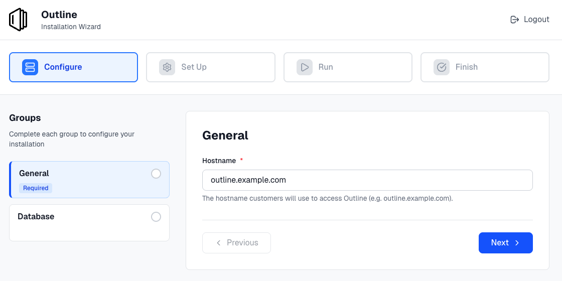
View a larger version of this image
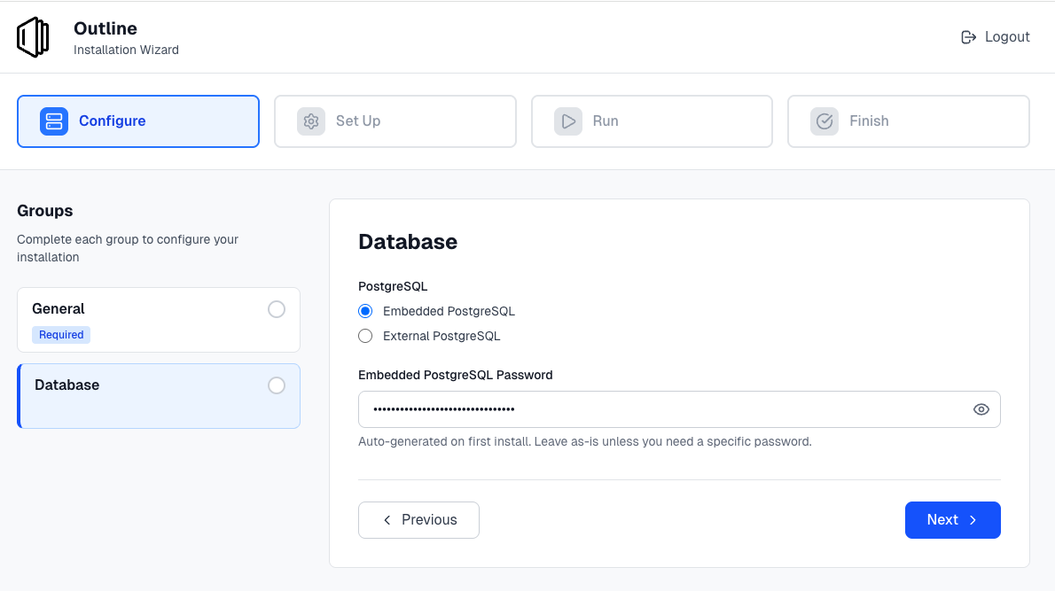
View a larger version of this image
Use config values in your Helm chart
After defining config fields, you map the user-supplied values to your Helm chart using the HelmChart v2 custom resource. In the HelmChart CR's values key, use the ConfigOption template function to reference config field values by name.
Example: Map config values to Helm chart values
Given the Config example on this page, the following HelmChart CR maps the database configuration to Helm values:
apiVersion: kots.io/v1beta2
kind: HelmChart
metadata:
  name: my-app
spec:
  chart:
    name: my-app
    chartVersion: 1.0.0
  values:
    postgresql:
      type: 'repl{{ ConfigOption "postgres_type" }}'
      host: 'repl{{ ConfigOption "external_postgres_host" }}'
      port: 'repl{{ ConfigOption "external_postgres_port" }}'
      database: 'repl{{ ConfigOption "external_postgres_database" }}'
      username: 'repl{{ ConfigOption "external_postgres_username" }}'
      password: 'repl{{ ConfigOption "external_postgres_password" }}'
      embeddedPassword: 'repl{{ ConfigOption "embedded_postgres_password" }}'
    hostname: 'repl{{ ConfigOption "hostname" }}'
The template functions are evaluated at install and upgrade time. The resulting values are passed to your Helm chart as if they were set in values.yaml.
Common patterns
The following are common patterns for using config values:
-
Conditional Helm values: Use
ConfigOptionEqualsto set values based on a selection:values:postgresql:enabled: 'repl{{ ConfigOptionEquals "postgres_type" "embedded_postgres" }}' -
Generated secrets: Config fields with a
valueusingRandomStringgenerate a value on first install and persist it across upgrades:# In the Config CR- name: session_secrettitle: Session Secrettype: passwordhidden: truevalue: 'repl{{ RandomString 32 }}' -
Boolean fields: Use
ConfigOptionEqualsto convert a bool field to a Helm value:values:features:enableFeatureX: 'repl{{ ConfigOptionEquals "enable_feature_x" "1" }}'
For more information about template functions for config values, see Config Context.
Group properties
Groups have a name, title, description and an array of items.
description
Descriptive help text for the group that displays on the config screen. Supports markdown formatting. To provide help text for individual items on the Config page, use the item help_text property. See help_text.
spec:
  groups:
    - name: example_group
      title: First Group
      # Provide a description of the input fields in the group
      description: Select whether or not to enable HTTP.
      items:
      - name: http_enabled
        title: HTTP Enabled
        type: bool
        default: "0"
name
A unique identifier for the group.
spec:
  groups:
    # The name must be unique
    - name: example_group
      title: First Group
      items:
      - name: http_enabled
        title: HTTP Enabled
        type: bool
        default: "0"
title
The title of the group that displays on the config screen.
spec:
  groups:
    - name: example_group
    # First Group is the heading that appears on the Config page
      title: First Group
      items:
      - name: http_enabled
        title: HTTP Enabled
        type: bool
        default: "0"
when
The when property denotes groups that display on the config screen only when a condition evaluates to true. When the condition evaluates to false, the group does not display.
This lets you conditionally show or hide fields so your end customers only see the options that are relevant to them.
You can use Go template functions to create conditional statements. Replicated provides a set of Go template functions that you can use to evaluate conditions like the user's environment, their license entitlements, and their previous configuration choices. For more information, see About Replicated Template Functions.
when is a property of both groups and items. See Item Properties > when.
Requirements and limitations
- The
whenproperty accepts the following types of values:- Booleans
- Strings that match "true", "True", "false", or "False"
- For the
whenproperty to evaluate to true, the values compared in the conditional statement must match exactly without quotes
Example
apiVersion: kots.io/v1beta1
kind: Config
metadata:
  name: outline-wiki-config
spec:
  groups:
    - name: database
      title: Database
      items:
        - name: postgres_type
          title: PostgreSQL
          type: select_one
          default: embedded_postgres
          items:
            - name: embedded_postgres
              title: Embedded PostgreSQL
            - name: external_postgres
              title: External PostgreSQL
        - name: embedded_postgres_password
          title: Embedded PostgreSQL Password
          type: password
          value: 'repl{{ RandomString 32 }}'
          when: 'repl{{ ConfigOptionEquals "postgres_type" "embedded_postgres" }}'
          help_text: |
            Auto-generated on first install. Leave as-is unless you need a specific password.
        - name: external_postgres_host
          title: Host
          type: text
          when: 'repl{{ ConfigOptionEquals "postgres_type" "external_postgres" }}'
          required: true
        - name: external_postgres_port
          title: Port
          type: text
          default: "5432"
          when: 'repl{{ ConfigOptionEquals "postgres_type" "external_postgres" }}'
        - name: external_postgres_database
          title: Database Name
          type: text
          default: outline
          when: 'repl{{ ConfigOptionEquals "postgres_type" "external_postgres" }}'
        - name: external_postgres_username
          title: Username
          type: text
          default: outline
          when: 'repl{{ ConfigOptionEquals "postgres_type" "external_postgres" }}'
        - name: external_postgres_password
          title: Password
          type: password
          when: 'repl{{ ConfigOptionEquals "postgres_type" "external_postgres" }}'
          required: true
items
Each group contains an array of items that map to input fields on the config screen. All items have name, title, and type properties and belong to a single group.
For more information, see Item Properties and Item Types.
If all items in a group hide because their when conditions evaluate to false, the group also hides, including its title and description. To ensure the group remains visible and shows messaging to the user, include a label item in the group without a when condition.
Item types
The section describes each of the item types:
booldropdownfileheadinglabelpasswordradioselect_one(Deprecated)texttextarea
bool
The bool input type should use a "0" or "1" to set the value
    - name: group_title
      title: Group Title
      items:
      - name: http_enabled
        title: HTTP Enabled
        type: bool
        default: "0"
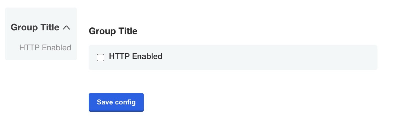
View a larger version of this image
dropdown
Introduced in KOTS v1.114.0
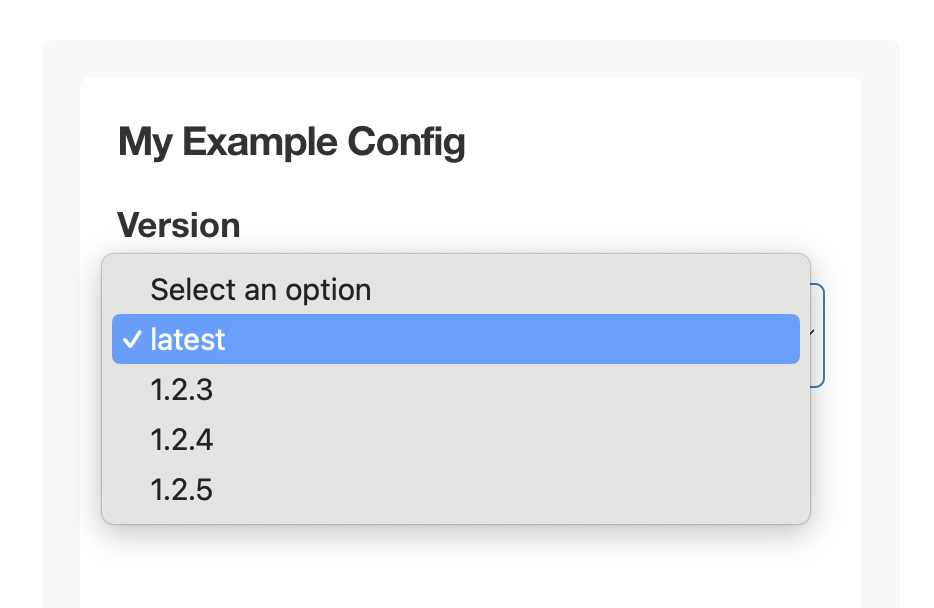
The dropdown item type includes one or more nested items that display in a dropdown on the config screen. Dropdowns are especially useful for displaying long lists of options. You can also use the radio item type to display radio buttons for items with shorter lists of options.
To set a default value for dropdown items, set the default field to the name of the target nested item.
spec:
  groups:
  - name: example_settings
    title: My Example Config
    items:
    - name: version
      title: Version
      default: version_latest
      type: dropdown
      items:
      - name: version_latest
        title: latest
      - name: version_123
        title: 1.2.3
      - name: version_124
        title: 1.2.4
      - name: version_125
        title: 1.2.5
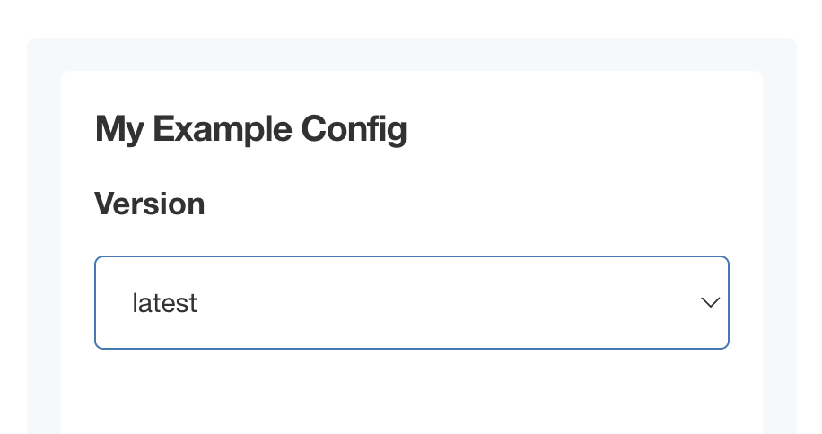
View a larger version of this image
View a larger version of this image
file
A file is a special type of form field that renders an <input type="file" /> HTML element.
The form field captures only the file contents, not the filename.
See the ConfigOptionData template function for examples on how to use the file contents in your application.
    - name: certs
      title: TLS Configuration
      items:
      - name: tls_private_key_file
        title: Private Key
        type: file
      - name: tls_certificate_file
        title: Certificate
        type: file
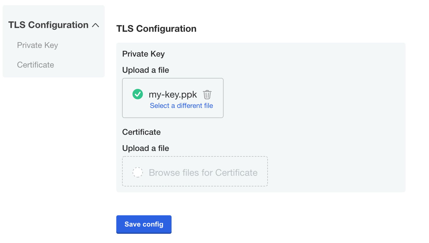
View a larger version of this image
heading
The heading type allows you to display a group heading as a sub-element within a group.
This is useful when you would like to use a config group to group items together, but still separate the items visually.
    - name: ldap_settings
      title: LDAP Server Settings
      items:
      ...
      - name: ldap_schema
        type: heading
        title: LDAP schema
      ...
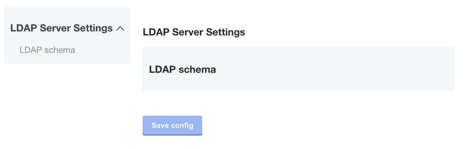
View a larger versio of this image
label
The label type allows you to display an input label.
    - name: email
      title: Email
      items:
      - name: email-address
        title: Email Address
        type: text
      - name: description
        type: label
        title: "Note: The system will send you an email every hour."
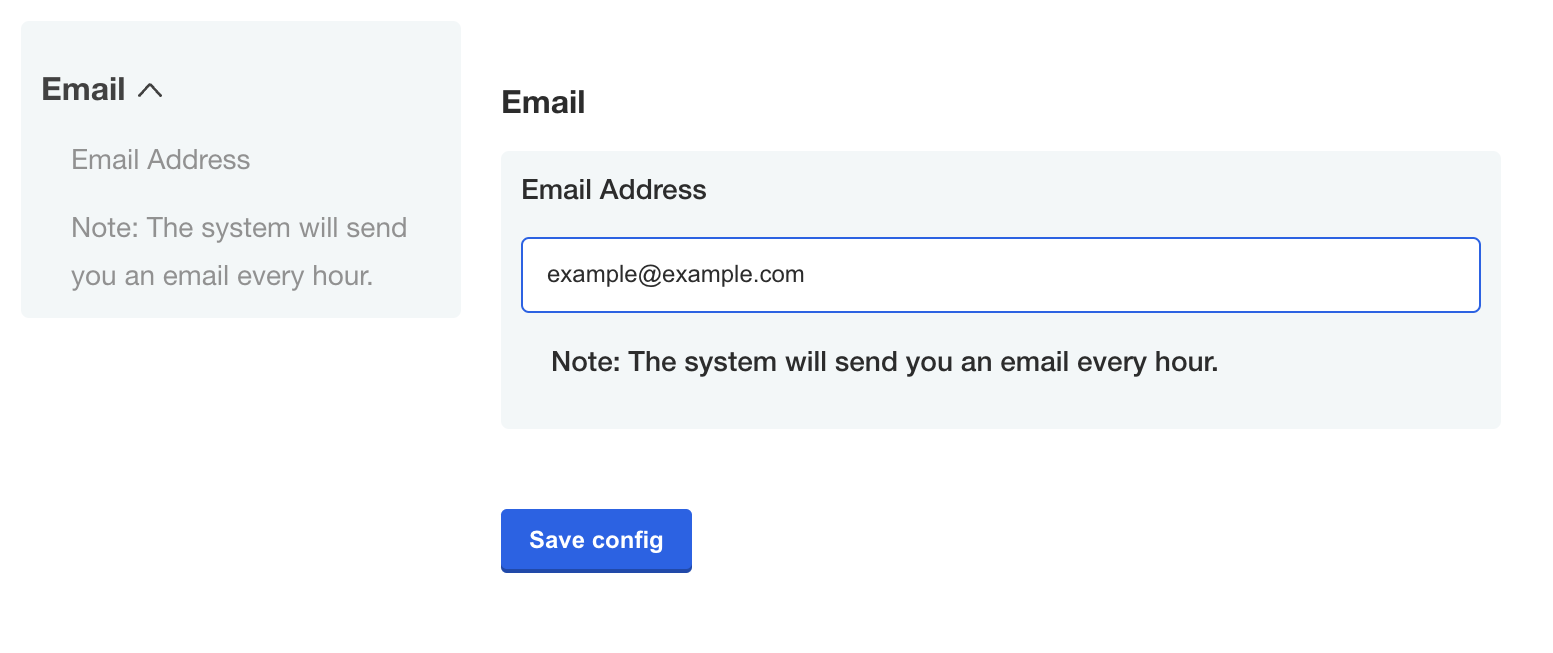
View a larger version of this image
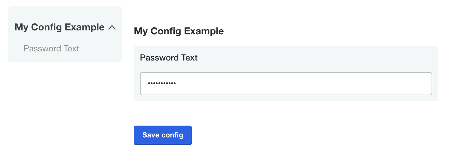
password
The password type is a text field that hides the character input.
    - name: password_text
      title: Password Text
      type: password
      value: '{{repl RandomString 10}}'
View a larger version of this image
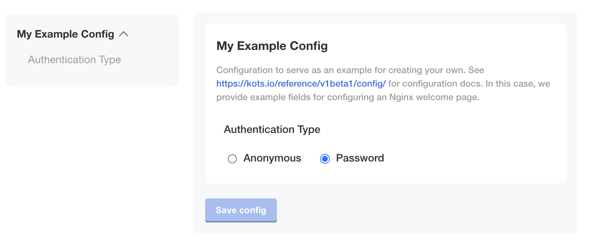
radio
Introduced in KOTS v1.114.0
The radio item type includes one or more nested items that display as radio buttons on the config screen. Radio buttons are especially useful for displaying short lists of options. You can also use the dropdown item type for items with longer lists of options.
To set a default value for radio items, set the default field to the name of the target nested item.
spec:
  groups:
  - name: example_settings
    title: My Example Config
    items:
    - name: authentication_type
      title: Authentication Type
      default: authentication_type_anonymous
      type: radio
      items:
      - name: authentication_type_anonymous
        title: Anonymous
      - name: authentication_type_password
        title: Password
select_one (Deprecated)
The select_one item type is deprecated. Use radio instead.
select_one items must contain nested items. The nested items display as radio buttons on the config screen.
Use the name field of a select_one item with Replicated template functions in the Config context (such as ConfigOption or ConfigOptionEquals) to return the user-selected option.
For example, if the user selects the Password option for the select_one item in the following example, then the template function '{{repl ConfigOption "authentication_type"}}' returns authentication_type_password. For more information about working with template functions in the Config context, see Config Context.
spec:
  groups:
  - name: example_settings
    title: My Example Config
    description: Configuration to serve as an example for creating your own.
    items:
    - name: authentication_type
      title: Authentication Type
      default: authentication_type_anonymous
      type: select_one
      items:
      - name: authentication_type_anonymous
        title: Anonymous
      - name: authentication_type_password
        title: Password
text
A text input field allows users to enter a string value.
Optionally, all additional properties are available for this input type.
    - name: example_text_input
      title: Example Text Input
      type: text
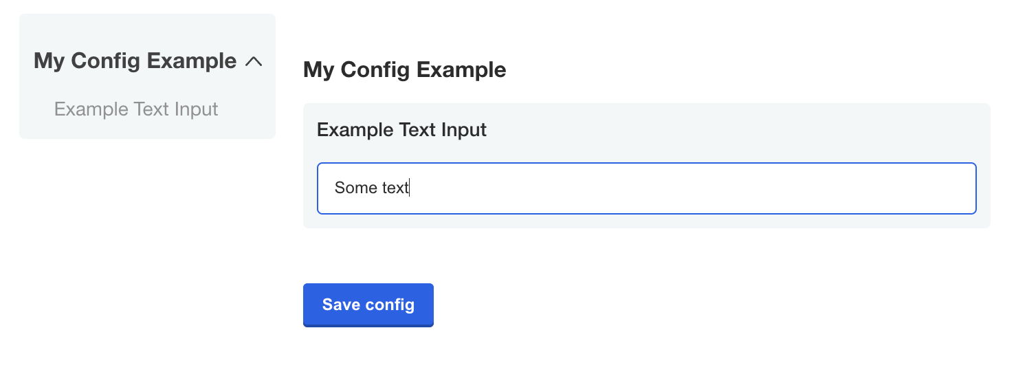
Do not store secrets or passwords in text items because they are not encrypted or masked and can be accessed. Instead, use password items.
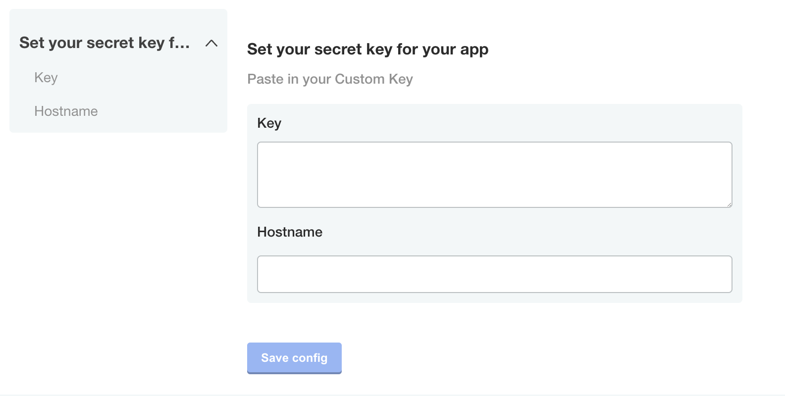
textarea
A textarea items creates a multi-line text input for when users have to enter a sizeable amount of text.
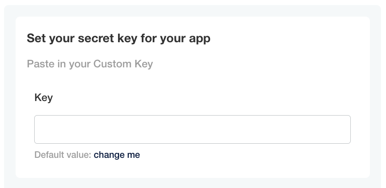
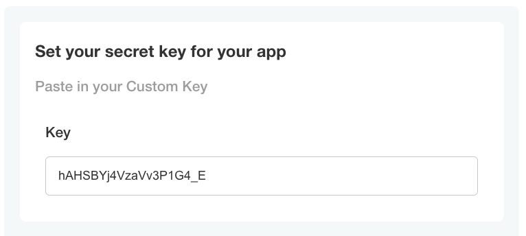
    - name: custom_key
      title: Set your secret key for your app
      description: Paste in your Custom Key
      items:
      - name: key
        title: Key
        type: textarea
      - name: hostname
        title: Hostname
        type: text
Item properties
Items have a name, title, type, and other optional properties.
affix
Affix items left or right to display them on the same line on the config screen.
Specify the affix field to all of the items in a particular group to preserve the line spacing and prevent the appearance of crowded text.
Example
groups:
- name: example_settings
  title: My Example Config
  description: Configuration to serve as an example for creating your own.
  items:
  - name: username
    title: Username
    type: text
    required: true
    affix: left
  - name: password
    title: Password
    type: password
    required: true
    affix: right
default
Defines the default value for the config item. If the user does not provide a value for the item, the default value takes effect.
If the default value is not associated with a password type config item, then it appears as placeholder text on the config screen.
The installer reevaluates Go template functions in the default property each time the user changes their configuration settings.
Example
- name: custom_key
  title: Set your secret key for your app
  description: Paste in your Custom Key
  items:
  - name: key
    title: Key
    type: text
    value: ""
    default: change me
View a larger version of this image
help_text
Displays a helpful message under the title for the config item on the config screen.
The property supports markdown syntax. For more information, see Basic writing and formatting syntax in the GitHub Docs.
Example
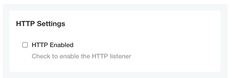
- name: http_settings
  title: HTTP Settings
  items:
  - name: http_enabled
    title: HTTP Enabled
    help_text: Check to enable the HTTP listener
    type: bool
View a larger version of this image
hidden
Hidden items are not visible on the config screen.
When you assign a template function that generates a value to a value property, you can use the readonly and hidden properties to define whether or not the generated value is ephemeral or persistent between changes to the configuration settings for the application. For more information, see RandomString in Static Context.
Limitation
The hidden property doesn't support Go templating.
Example
- name: secret_key
  title: Secret Key
  type: password
  hidden: true
  value: "{{repl RandomString 40}}"
name (Required)
A unique identifier for the config item. Item names must be unique both within the group and across all groups. The item name is not displayed on the config screen.
Use the item name with Replicated template functions in the Config context (such as ConfigOption or ConfigOptionEquals) to return the value of the item. For more information, see Config Context.
Example
- name: http_settings
  title: HTTP Settings
  items:
  - name: http_enabled
    title: HTTP Enabled
    type: bool
readonly
Readonly items display on the config screen and users cannot edit their value.
When you assign a template function that generates a value to a value property, you can use the readonly and hidden properties to define whether or not the generated value is ephemeral or persistent between changes to the configuration settings for the application. For more information, see RandomString in Static Context.
Limitation
The readonly property doesn't support Go templating.
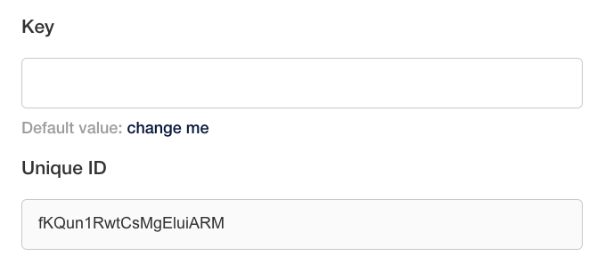
Example
- name: key
  title: Key
  type: text
  value: ""
  default: change me
- name: unique_key
  title: Unique Key
  type: text
  value: "{{repl RandomString 20}}"
  readonly: true
View a larger version of this image
recommended
Displays a Recommended tag for the config item on the config screen.
Limitations
- The
recommendedproperty doesn't support Go templating. - Embedded Cluster v3 doesn't support the
recommendedproperty
Example
- name: recommended_field
  title: My recommended field
  type: bool
  default: "0"
  recommended: true

View a larger version of this image
required
Displays a Required tag for the config item on the config screen. A required item prevents the application from starting until it has a value.
Limitation
The required property doesn't support Go templating.
Example
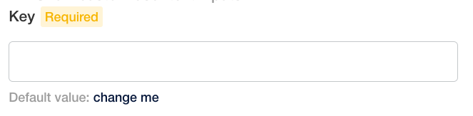
    - name: custom_key
      title: Set your secret key for your app
      description: Paste in your Custom Key
      items:
      - name: key
        title: Key
        type: text
        value: ""
        default: change me
        required: true
View a larger version of this image
title (Required)
The title of the config item that displays on the config screen.
Example
- name: http_settings
  title: HTTP Settings
  items:
  - name: http_enabled
    title: HTTP Enabled
    help_text: Check to enable the HTTP listener
    type: bool
View a larger version of this image
type (Required)
Each item has a type property that defines the type of user input accepted by the field.
The type property supports the following values:
booldropdownfileheadinglabelpasswordradioselect_one(Deprecated)texttextarea
For information about each type, see Item Types.
Limitation
The type property doesn't support Go templating.
Example
- name: group_title
  title: Group Title
  items:
  - name: http_enabled
    title: HTTP Enabled
    type: bool
    default: "0"
View a larger version of this image
value
Defines the value of the config item. Data that you add to value appears as the HTML input value for the config item on the config screen.
If the config item is not readonly, then the data that you add to value is overwritten by any user input for the item. If the item is readonly, then the data that you add to value cannot be overwritten.
When you assign a template function that generates a value to a value property, you can use the readonly and hidden properties to define whether or not the generated value is ephemeral or persistent between changes to the configuration settings for the application. For more information, see RandomString in Static Context.
Example
- name: custom_key
  title: Set your secret key for your app
  description: Paste in your Custom Key
  items:
  - name: key
    title: Key
    type: text
    value: "{{repl RandomString 20}}"
View a larger version of this image
when
The when property denotes items that display on the config screen only when a condition evaluates to true. When the condition evaluates to false, the item does not display.
This lets you conditionally show or hide fields so your end customers only see the options that are relevant to them.
You can use Go template functions to create conditional statements. Replicated provides a set of Go template functions that you can use to evaluate conditions like the user's environment, their license entitlements, and their previous configuration choices. For more information, see About Replicated Template Functions.
when is a property of both groups and items. See Group Properties > when above.
Requirements
- The
whenproperty accepts the following types of values:- Booleans
- Strings that match "true", "True", "false", or "False"
- For the
whenproperty to evaluate to true, the values compared in the conditional statement must match exactly without quotes
- Do not apply
whento items nested under aradio,dropdown, orselect_oneitem. To conditionally show or hideradio,dropdown, orselect_oneitems, apply thewhenproperty to the item itself.
Example
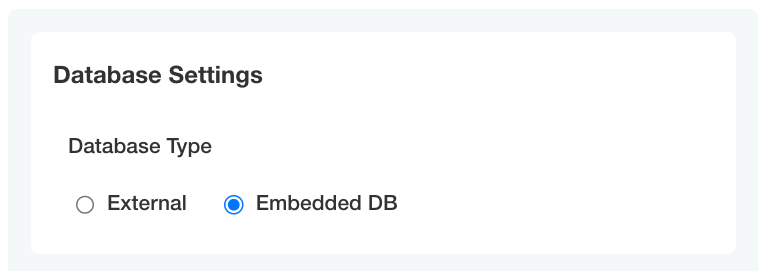
Display the database_host and database_password items only when the user selects external for the db_type item:
- name: database_settings_group
  title: Database Settings
  items:
  - name: db_type
    title: Database Type
    type: radio
    default: external
    items:
    - name: external
      title: External
    - name: embedded
      title: Embedded DB
  - name: database_host
    title: Database Hostname
    type: text
    when: repl{{ (ConfigOptionEquals "db_type" "external")}}
  - name: database_password
    title: Database Password
    type: password
    when: repl{{ (ConfigOptionEquals "db_type" "external")}}

View a larger version of this image
View a larger version of this image
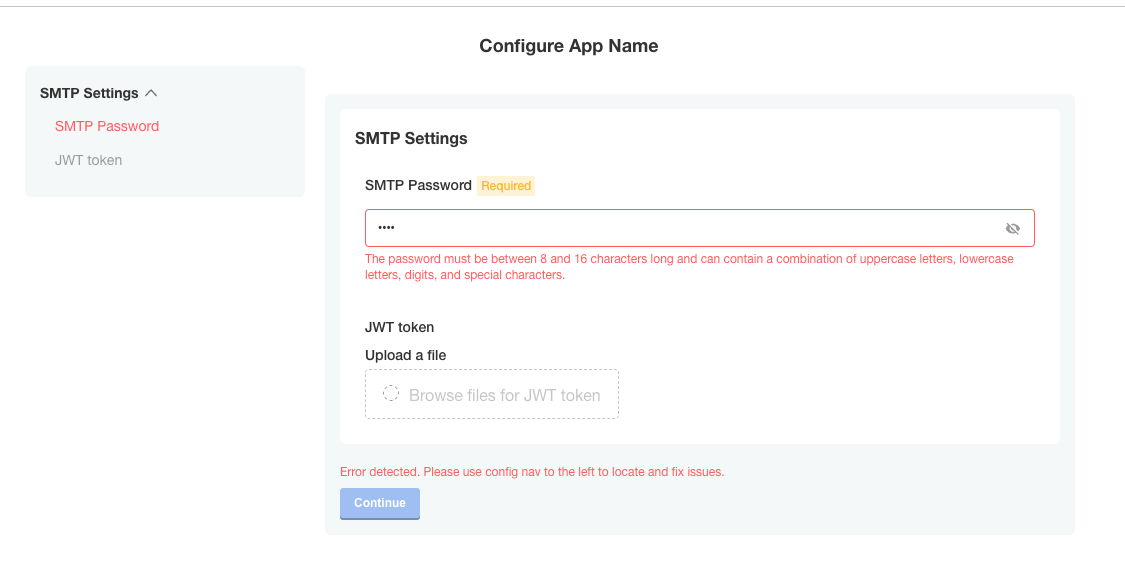
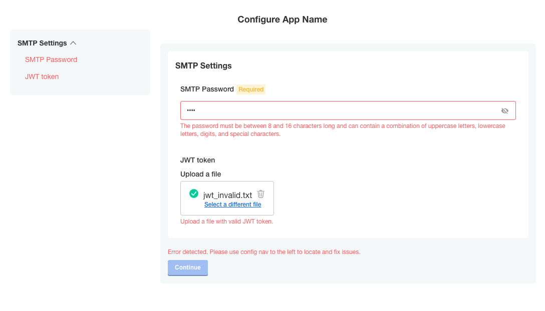
validation
Use the validation property to validate an item's value and specify custom validation rules that determine whether the value is valid.
You can use regex to validate whether an item's value matches the provided regular expression pattern. The regex pattern should be of the RE2 regular expression type and can validate the text, textarea, password, and file field types.
Based on specified validation rules, the item is validated and a validation message is returned if the validation rule is not satisfied. A default message is returned if there is an empty validation message.
The validation rules are as follows:
- An item is validated only when its value is not empty.
- Items of types
text,textarea,password, andfileare validated, butrepeatableitems are not validated. - If an item is marked as
hiddenor if itswhencondition is set tofalse, the item is not validated. - If a group
whencondition is set tofalse, the items in the group are not validated.
Limitation
The validation property doesn't support Go templating.
Example
Validates and returns if password value is not matching the regex.
The jwt_token file content is only validated if the file is uploaded since it is optional.
- name: smtp-settings
  title: SMTP Settings
  - name: smtp_password
    title: SMTP Password
    type: password
    required: true
    validation:
      regex:
        pattern: ^(?:[\w@#$%^&+=!*()_\-{}[\]:;"'<>,.?\/|]){8,16}$
        message: The password must be between 8 and 16 characters long and can contain a combination of uppercase letters, lowercase letters, digits, and special characters.
  - name: jwt_token
    title: JWT token
    type: file
    validation:
      regex:
        pattern: ^[A-Za-z0-9-_]+\\.[A-Za-z0-9-_]+\\.[A-Za-z0-9-_]*$
        message: Upload a file with valid JWT token.
View a larger version of this image
View a larger version of this image
Repeatable Items
A repeatable config item copies a YAML array entry or YAML document for as many values as are provided. Any number of values can be added to a repeatable item to generate additional copies.
To make an item repeatable, set repeatable to true:
    - name: ports_group
      items:
      - name: serviceport
        title: Service Port
        type: text
        repeatable: true
Repeatable items do not use the default or value fields, but instead a valuesByGroup field.
valuesByGroup must have an entry for the parent Config Group name, with all of the default key:value pairs nested in the group. The repeatable item requires at least one default entry:
    valuesByGroup:
      ports_group:
        port-default-1: "80"
Limitations
- Repeatable items work only for text, textarea, and file types.
- Repeatable item names must only consist of lower case alphanumeric characters.
- Repeatable items are only supported for Kubernetes manifests, not Helm charts.
Template targets
Repeatable items require that you provide at least one template. The template defines a YAML target in the manifest to duplicate for each repeatable item.
Required fields for a template target are apiVersion, kind, and name.
namespace is an optional template target field to match a YAML document's metadata.namespace property when the same filename appears in multiple namespaces.
The installer duplicates the entire YAML node at the target, including nested fields.
The yamlPath field of the template must denote index position for arrays using square brackets. For example, spec.ports[0] selects the first port entry for duplication. The installer appends all duplicate YAML to the final array in the yamlPath.
yamlPath must end with an array.
Example:
    templates:
    - apiVersion: v1
      kind: Service
      name: my-service
      namespace: my-app
      yamlPath: 'spec.ports[0]'
If the yamlPath field is not present, the installer replaces the entire YAML document matching the template with a copy for each repeatable item entry. The metadata.name field of the new document reflects the repeatable item key.
Templating
Use the delimiters repl[[ .itemName ]] or [[repl .itemName ]] for repeat items. Place these delimiters anywhere inside the yamlPath target node:
    - port: repl{{ ConfigOption "[[repl .serviceport ]]" | ParseInt }}
      name: '[[repl .serviceport ]]'
This repeatable templating is not compatible with sprig templating functions. Use it to insert repeatable keys into the manifest. You can nest repeatable templating inside Replicated config templating.
Ordering
The installer processes repeatable templates before config template rendering.
The installer processes repeatable items in order of the template targets in the Config Spec file. Effectively, this ordering is from the top of the Config Spec, by Config Group, by Config Item, and then by template target.
    - name: ports_group
      items:
      - name: serviceport
        title: Service Port
        type: text
        repeatable: true
        templates:
        - apiVersion: v1 #processed first
          kind: Service
          name: my-service
          namespace: my-app
          yamlPath: 'spec.ports[0]'
        - apiVersion: v1 #processed second
          kind: Service
          name: my-service
          namespace: my-app
        {other item properties ...}
      - name: other_ports
        title: Other Service Port
        type: text
        repeatable: true
        templates:
        - apiVersion: v1 #processed third
          kind: Service
          name: my-other-service
          namespace: my-app
        {other item properties ...}
    - name: deployments
      items:
      - name: deployment-name
        title: Deployment Names
        type: text
        repeatable: true
        templates:
        - apiVersion: apps/v1 #processed fourth
          kind: Deployment
          name: my-deployment
          namespace: my-app
        {other item properties ...}
Repeatable examples
In these examples, the release includes the default service port "80". When you add port 443 as an additional port on the config screen, The installer stores it in the ConfigValues file.
Repeatable item example for a yamlPath
Config custom resource manifest file:
    - name: ports_group
      items:
      - name: serviceport
        title: Service Port
        type: text
        repeatable: true
        templates:
        - apiVersion: v1
          kind: Service
          name: my-service
          namespace: my-app
          yamlPath: spec.ports[0]
        valuesByGroup:
          ports_group:
            port-default-1: "80"
Config values:
apiVersion: kots.io/v1beta1
kind: ConfigValues
metadata:
  name: example_app
spec:
  values:
    port-default-1:
      repeatableItem: serviceport
      value: "80"
    serviceport-8jdn2bgd:
      repeatableItem: serviceport
      value: "443"
Template manifest:
apiVersion: v1
kind: Service
metadata:
  name: my-service
  namespace: my-app
spec:
  type: NodePort
  ports:
  - port: repl{{ ConfigOption "[[repl .serviceport ]]" | ParseInt }}
    name: '[[repl .serviceport ]]'
  selector:
    app: repeat_example
    component: my-deployment
After repeatable config processing:
Note: This phase is internal to configuration rendering for KOTS. This example is only provided to further explain the templating process.*
apiVersion: v1
kind: Service
metadata:
  name: my-service
  namespace: my-app
spec:
  type: NodePort
  ports:
  - port: repl{{ ConfigOption "port-default-1" | ParseInt }}
    name: 'port-default-1'
  - port: repl{{ ConfigOption "serviceport-8jdn2bgd" | ParseInt }}
    name: 'serviceport-8jdn2bgd'
  selector:
    app: repeat_example
    component: my-deployment
Resulting manifest:
apiVersion: v1
kind: Service
metadata:
  name: my-service
  namespace: my-app
spec:
  type: NodePort
  ports:
  - port: 80
    name: port-default-1
  - port: 443
    name: serviceport-8jdn2bgd
  selector:
    app: repeat_example
    component: my-deployment
Repeatable Item Example for an Entire Document
Config spec:
    - name: ports_group
      items:
      - name: serviceport
        title: Service Port
        type: text
        repeatable: true
        templates:
        - apiVersion: v1
          kind: Service
          name: my-service
          namespace: my-app
        valuesByGroup:
          ports_group:
            port-default-1: "80"
Config values:
apiVersion: kots.io/v1beta1
kind: ConfigValues
metadata:
  name: example_app
spec:
  values:
    port-default-1:
      repeatableItem: serviceport
      value: "80"
    serviceport-8jdn2bgd:
      repeatableItem: serviceport
      value: "443"
Template manifest:
apiVersion: v1
kind: Service
metadata:
  name: my-service
  namespace: my-app
spec:
  type: NodePort
  ports:
  - port: repl{{ ConfigOption "[[repl .serviceport ]]" | ParseInt }}
  selector:
    app: repeat_example
    component: repl[[ .serviceport ]]
After repeatable config processing:
Note: This phase is internal to configuration rendering for KOTS. This example is only provided to further explain the templating process.*
apiVersion: v1
kind: Service
metadata:
  name: port-default-1
  namespace: my-app
spec:
  type: NodePort
  ports:
  - port: repl{{ ConfigOption "port-default-1" | ParseInt }}
  selector:
    app: repeat_example
    component: port-default-1
---
apiVersion: v1
kind: Service
metadata:
  name: serviceport-8jdn2bgd
  namespace: my-app
spec:
  type: NodePort
  ports:
  - port: repl{{ ConfigOption "serviceport-8jdn2bgd" | ParseInt }}
  selector:
    app: repeat_example
    component: serviceport-8jdn2bgd
Resulting manifest:
apiVersion: v1
kind: Service
metadata:
  name: port-default-1
  namespace: my-app
spec:
  type: NodePort
  ports:
  - port: 80
  selector:
    app: repeat_example
    component: port-default-1
---
apiVersion: v1
kind: Service
metadata:
  name: serviceport-8jdn2bgd
  namespace: my-app
spec:
  type: NodePort
  ports:
  - port: 443
  selector:
    app: repeat_example
    component: serviceport-8jdn2bgd